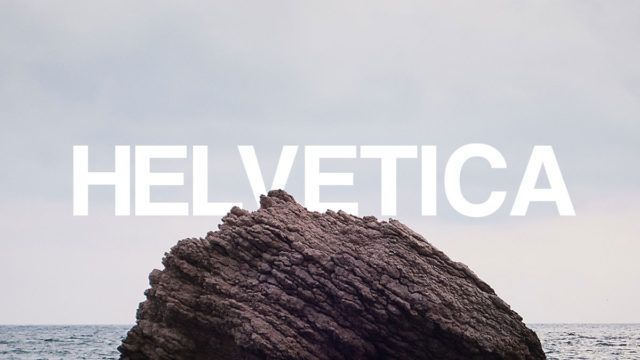
What is UX Design?
In recent years, website design has taken an interesting turn. With advances in the way websites are created, designers are able to provide much more than an online brochure. We’re able to create an experience for users. It’s an opportunity for brands to create an environment where customers are able to actually experience something without having to be in a physical space. What I’m referring to is user experience.
Nowadays, user experience is more important than ever. We strongly urge our customers to keep this in mind when creating a website. But what makes user experience good or bad? Ultimately, this is subjective. However, we recently reviewed several craft brewery websites in order to get a better idea of what answers that question. Here’s what we came up with:

If you’ve ever been to Ratio Beerworks in Denver, you know that it’s one of Denver’s best breweries. The beer they serve is great, but what makes it memorable for me is the space itself. Think wide open space, lawn games, and punk rock.
The Ratio Beerworks website does a great job of providing users with an experience that is similar to being at the actual brewery. The use of grungy halftone textures and clean layout remind me of the space in Denver. It’s clear that Ratio made it a point to ensure their brand is a part of everything they do, which makes it really successful in terms of user experience both in their physical bar and their website.
Reviewed by Blake Lockard, TMRC Designer

10 Barrel’s website is immediately eye catching and easy to navigate. The side navigation is easy to find and large making it very simple to use. Their use of black and white and clean lines leaves no room for confusion when making your way around the site. Using video right off the bat catches the user’s attention and keeps them engaged in the company message. You can really tell who their target market is and they do a great job sticking to it.
Reviewed by Hayden Zigurs, TMRC Designer

Perhaps I’m a little old school, but I’m a sucker for well executed, clever interactive animation. Sure, Flash is in the grave but I always enjoyed the clever and imaginative possibilities when it was done right. Clearly, this isn’t Flash, but it immediately loaded (even on the worst of the worst hotel wireless!) and it immediately had me clicking and moving my mouse around the page.
Back to the old school part … aside from Fat Tire, back in my college days, Buff Gold to me was THE craft brew or brews. So I was happy to see them still doing original things.
Reviewed by Kevin Roberts, TMRC Owner

At first glance, the Camden Town Brewery website is bright, colorful, and clean. Once I dug into it a little more, I realized I was looking at a website that wasn’t too far from what local softball league team’s would look like. Everything from the messaging to the bright colors screams “Take me out to the ball game, and join our team!”. It’s really clever and I love what’s going on with it. I think if I were actually part of a softball league I would’ve caught onto the branding a bit faster. Overall, I’d say the website does a great job of portraying a brand of beer that is perfect for cracking open with the boys (and girls) after a game.
Reviewed by Blake Lockard, TMRC Designer

In a more traditional sense of judging modern UI/UX, I found Upslope’s design to be most appealing and user friendly. Loaded very fast, navigation was large and very responsive. I especially how they tweaked the parallax design to fit their brand. Oddly, this is the first time that I recall seeing this done. Perhaps having seen interesting variations to a theme, but not to directly match the brand. The rest of the site is well done with consistent posts. Blog is timely and the events page is very thorough and well executed.
Reviewed by Kevin Roberts, TMRC Owner