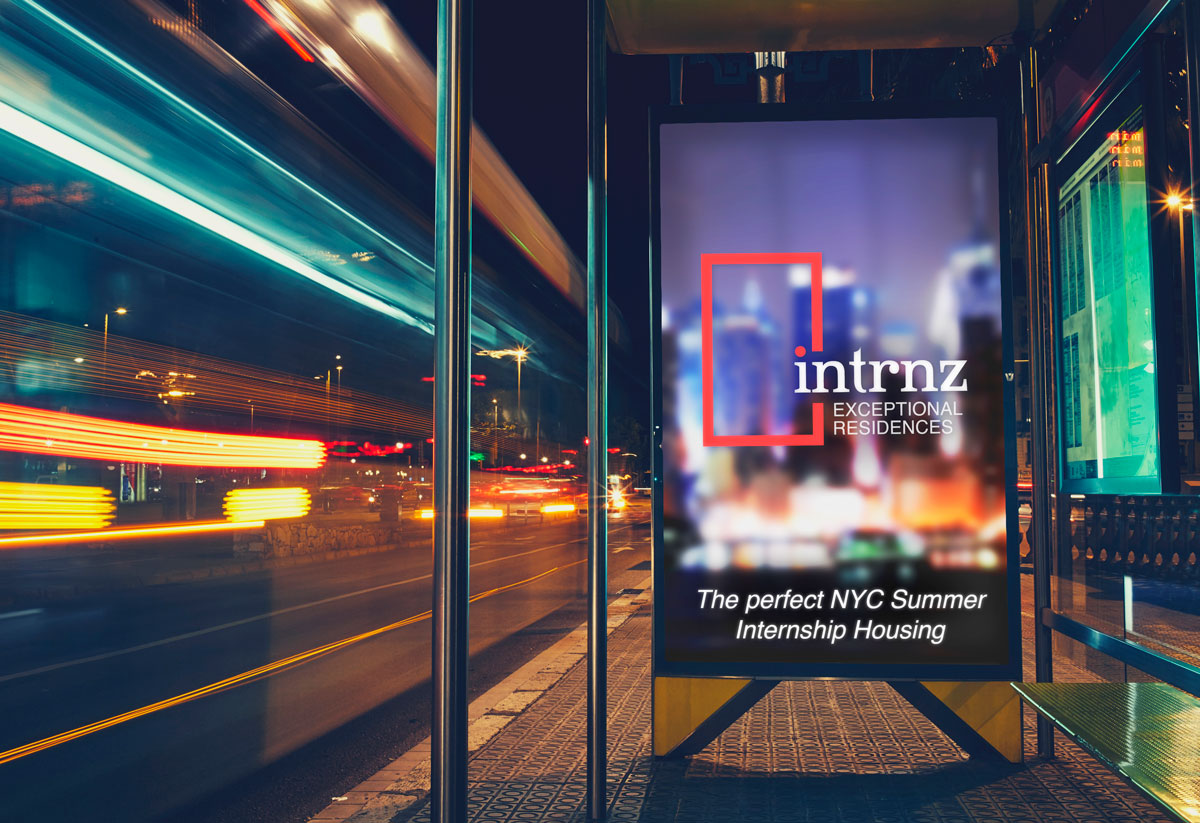
Intrnz.com is a service specializing in acquiring student housing for summer interns in New York City. It’s target client is one that seeks an extra level of concierge type service for an other wise unwelcoming and frustrating experience. It was important to have a logo that was client facing (students), but also appealing to college and university professionals.
TMRC often hides subtle details or symbolism in brand creative. In this instance, the “easter egg” isn’t all that hidden, but may not be readily apparent to all viewers. The concept of the red door has long been a welcoming symbol for travelers. Digging a bit deeper, the theology behind a red door also symbolized safe refuge, good luck, positive energy etc. All traits that directly align with Intrnz brand mantras.
![]()